Mobile Email Designs: A Guide to Improving Clicks through
Arnav Jalan
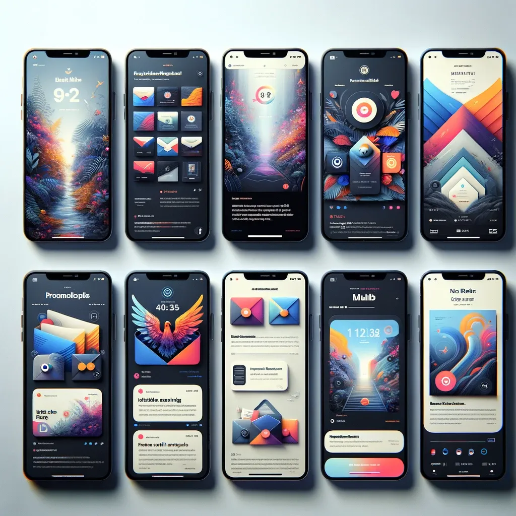
email design
Mobile email designs are important in today’s digital world, where the majority of users access their emails through mobile devices. The key to success lies in optimizing your email for these users, ensuring that the content is easily readable and interactive on smaller screens.
Key Takeaways
Responsive Email Design — Responsive email design is a cornerstone of effective email marketing, especially when targeting mobile users.
Mobile-Friendly Email Templates — Mobile-friendly email templates are a necessity in today’s mobile-centric world.
Optimizing Emails for Mobile Devices — Optimizing emails for mobile devices is vital for reaching the broad audience of mobile email users.
Creating Mobile-First Email Designs — Creating mobile-first email designs is about prioritizing the mobile experience in your email marketing strategy.
Email Marketing for Mobile — Email marketing for mobile is an necessary strategy in today’s digital marketing landscape.
Designing Mobile-Friendly Templates — Designing mobile-friendly templates is a best practice in today's email marketing, focusing on ensuring every email is optimized for mobile devices.
This involves using a responsive email design that adjusts content layout according to the screen size. A mobile-friendly email should also consider font size and button sizes, making them accessible for touch navigation. Incorporating these elements in your mobile email design can significantly enhance user engagement and improve click-through rates in your email campaigns.
Email Design Best Practices
A well-designed email should have a balance of text and visuals, with a clear call-to-action. Prioritize simplicity and clarity, making sure that your message is easily understood at a glance. Plus, regular testing across various email clients and devices is vital to ensure compatibility and effectiveness.
Responsive Email Design
Responsive email design is a cornerstone of effective email marketing, especially when targeting mobile users. It involves creating email templates that automatically adjust to fit the screen size of any device, from desktops to smartphones.
This responsiveness ensures that your email content is easily readable and visually appealing across different platforms. To achieve this, use fluid layouts, flexible images, and scalable font sizes. Responsive design not only improves user experience but also boosts engagement rates, as it caters to the growing number of mobile email users.
Mobile-Friendly Email Templates
Mobile-friendly email templates are a necessity in today’s mobile-centric world. These templates are designed to look good and function well on mobile devices. Key features include a single-column layout, larger fonts, and easily clickable buttons, all of which contribute to a better reading and navigation experience. Employing mobile-friendly templates in your email marketing strategy can significantly increase the effectiveness of campaigns, as they cater to the preferences and needs of mobile users.
Optimizing Emails for Mobile Devices
Optimizing emails for mobile devices is vital for reaching the broad audience of mobile email users. This involves designing emails that are easy to read and navigate on smaller screens. Key aspects include using a responsive email design, optimizing images for fast loading, and using a suitable font size for readability.
Creating Mobile-First Email Designs
Creating mobile-first email designs is about prioritizing the mobile experience in your email marketing strategy. This approach involves designing template with mobile users in mind from the start, rather than simply adapting a desktop design for mobile.
This means considering factors like touch navigation, smaller screen sizes, and varied email clients. A mobile-first approach ensures that campaign is accessible and engaging for the largest segment of your audience, who are increasingly accessing their emails via .
Email Marketing for Mobile
Email marketing for mobile is an necessary strategy in today’s digital marketing landscape. It focuses on creating email campaigns that are optimized devices, ensuring a easy and engaging experience users. Key considerations include using a responsive email design, ensuring fast loading times, and making content easily digestible on smaller screens.
Effective email marketing also involves understanding the behavior of mobile users and tailoring content . By focusing on mobile-friendly strategies, businesses can significantly increase their engagement and conversion rates.
Designing Mobile-Friendly Templates
Designing mobile-friendly templates is a best practice in today's email marketing, focusing on ensuring every email is optimized for . To create mobile-friendly email designs, it's key to use responsive web design principles that adapt the layout for various screen sizes.
This means designing an email with a simple, single-column layout, larger fonts, and easily clickable buttons. consider how users interact with their mobile phones and design your email copy and layout . Utilizing these design elements enhances the mobile experience, increasing the likelihood that recipients will open the email and engage with the content.
Creating Responsive Email Templates
Creating responsive email templates is key to a successful mobile-first email design strategy. Responsive design ensures that the email layout automatically adjusts to fit different screen sizes, from desktop monitors to mobile phones. This requires a solid understanding of HTML email design and the use of media queries in web design.
When you create responsive email templates, it's vital to test the email across multiple devices and email clients to ensure a consistent experience. A well-designed responsive email enhances user engagement by providing an optimal viewing experience regardless of the device used to open the email.
Mobile Optimization Techniques
Mobile optimization techniques are critical in ensuring that devices provides an optimal user experience. This involves more than just a responsive design; it requires a deep understanding of mobile design elements and user behavior. Optimized means considering the limitations and features of mobile displays, such as smaller screen sizes and touch-screen interfaces.
Techniques include compressing images for faster loading, using large, legible fonts, and placing key information and call-to-action buttons within easy reach. These techniques ensure that opens correctly and is easily navigable on , enhancing the effectiveness of campaign.
Email Layout for Mobile Devices
Email layout devices demands a different approach compared to traditional desktop layouts. The best email layout for mobile is one that considers the limited screen space and the way users interact with mobile email. A mobile-first design prioritizes simplicity and readability, often employing a single-column layout that stacks content vertically.
This makes it easier for users to scroll through the email on their mobile phones. Key design elements like headlines, images, and calls to action should be prominently displayed and easily accessible. A well-thought-out email layout not only improves readability but also enhances the user's experience, increasing the likelihood of engagement.
Mobile Design Elements
Mobile design elements are key in creating an effective email design . When you design an email, consider the unique features of mobile devices, such as touch screens and smaller display sizes. Mobile design elements include using finger-friendly buttons, optimizing images to load quickly and look sharp on high-resolution screens, and using legible font sizes for easy reading.
Testing Emails on Mobile Devices
Testing emails on is a critical step in the email design process. It ensures that your email not only looks good but also functions properly across various mobile platforms. Test email designs on different devices and email clients to check how they display and interact with the content.
This includes assessing load times, image rendering, link functionality, and layout. Regular testing helps identify and fix issues that could hinder the user experience or prevent the email from being properly displayed. By thoroughly testing emails on , you ensure that your message reaches your audience as intended, maximizing the impact of campaigns.
Optimizing Content for Mobile Email
Optimizing content email is fundamental in creating an effective email experience for users on the go. The key is to make sure is concise, engaging, and easily navigable on a small screen. This involves using a responsive template that adjusts to different device sizes, ensuring your marketing emails are accessible and readable.
Key elements include short and compelling subject lines, a clear and concise message, and a strong call-to-action. Also, consider the loading time of ; optimize images and minimize the use of heavy graphics to ensure quick load times. By optimizing emails for mobile, you ensure that your message is effectively communicated, regardless of the device used to access it.
Email Copy for Mobile Devices
Crafting email copy devices requires a different approach compared to desktop. The goal is to create content that is easy to digest and engaging for users viewing emails on their mobile phones. This means using shorter paragraphs, clear and concise language, and bullet points to break down information.
A fluid design approach ensures that your email content flows smoothly across different screen sizes. It's also important to start with the most important information, as mobile users often skim content. By focusing on these elements, you can enhance the effectiveness of campaigns users.
Font Size and Readability in Mobile Email
Font size and readability are significant aspects of mobile email design, directly impacting email accessibility and user engagement. When creating mobile emails, it's core to use a font size that is easy to read on small screens. A general best practice is to use a minimum font size of 16 pixels for body text.
The choice of font type also matters; choose clean and simple fonts for better readability. Remember, the design and code of your responsive template should ensure that text is easily resizable without breaking the layout. Test s across different devices to make sure that text is legible and the layout remains intact, ensuring a effortless email experience for all users.
Email Design for Various Mobile Devices
Email design for various involves understanding and adapting to the wide range of screen sizes and resolutions in the market. To optimize emails , use a responsive design that fluidly adjusts to different screen sizes, ensuring your emails look and function well across all devices.
This includes considering how layout, images, and call-to-action buttons appear on both smaller smartphones and larger tablets. Utilizing a fluid design approach helps maintain the integrity of 's layout and content, regardless of the device. Regularly testing s on different devices is important to ensure consistent quality and user experience.
Mobile Email Display Testing
Mobile email display testing is a critical step in ensuring your marketing emails are effective and engaging. test your emails across a variety of mobile devices to ensure that they look and function as intended. This includes checking the layout, image rendering, link functionality, and responsiveness.
Display testing helps identify any issues that might affect the user experience, such as texts that are too small to read or buttons that are hard to click. By rigorously testing designs, you can ensure a high level of email accessibility and a positive experience for all recipients, regardless of the device they use.
Design Inspiration for Mobile-Friendly Emails
Finding design inspiration for mobile-friendly emails is key to creating engaging and effective email campaigns. Look for the 8 best examples in your industry that effectively balance aesthetics with functionality. Study these examples to understand how they use responsive templates, fluid design, and accessible content to enhance the mobile email experience.
Pay attention to how they structure their content, use images, and place call-to-action buttons. On top of that, consider exploring free email design resources online for fresh ideas and tips. Drawing inspiration from successful email designs can help you create mobile-friendly emails that not only look great but also drive user engagement and conversions.

Engagement Strategies for Mobile Email
Developing engagement strategies email involves understanding how users interact with emails on . A key aspect is designing to display optimally on , ensuring the content is easily digestible and engaging. This can be achieved by creating a responsive email with HTML code that adapts to different screen sizes.
Sending a test email to multiple devices and email clients is critical to ensure your design works easily. Plus, personalization plays a significant role; tailor your content to resonate with the mobile audience. By focusing on mobile optimization, you can enhance the likelihood that recipients will read and engage with your content, boosting the effectiveness of your email marketing campaigns.
Increasing Email Opens on Mobile
To increase email opens on mobile, ensure your email campaigns are optimized for the platform. This means not only designing an email that is visually appealing on a mobile device but also crafting compelling subject lines. Remember, the first impression of is not necessarily the content but the subject line.
Use concise, engaging, and action-oriented language. Also, consider the timing of sending s; analyze when your audience is most likely to open an email on their . A/B testing different subject lines and sending times can provide valuable insights into what works best for your audience.
Enhancing Mobile User Experience in Emails
Enhancing the mobile user experience in emails involves more than just responsive design. While ensuring is optimized devices through HTML code and design process adjustments is necessary, there's also a need to focus on content structure and interactivity. This means creating shorter, more engaging content that is easy to navigate on a small screen.
Include clear and compelling calls-to-action that are easy to click. Remember, an email viewed on a mobile device should offer a smooth experience, from opening the email to interacting with its content. Regularly send a test email to check how your email renders on various devices, ensuring a consistent and enjoyable user experience.
Mobile-Specific Email Campaigns
It's also important to consider the different ways mobile users interact with emails compared to desktop users. For instance, touch-friendly elements and easy-to-navigate layouts are key. By focusing on mobile-specific elements, campaigns become more effective in engaging the growing number of users who primarily read on mobile devices.
Mobile-Optimized Email CTAs
Mobile-optimized email CTAs (Calls to Action) are a necessary element in enhancing engagement and conversion rates in email marketing campaigns. When designing , it’s important to ensure that CTAs are prominently displayed and easy to interact with on . This means using large, finger-friendly buttons and placing them strategically within the email to catch the user's attention.
The language used in CTAs should be compelling and action-oriented, encouraging users to take the desired action. Also, consider the color and contrast of your CTA buttons to make them stand out. A/B testing different CTA designs can be helpful in determining what resonates best with your mobile audience.
Monitoring Email Performance on Mobile Devices
Monitoring email performance on is critical for understanding the effectiveness of your email marketing campaigns. This involves using analytics tools like Email on Acid to test and track how s are being received and interacted with on various mobile platforms. Pay attention to metrics such as open rates, click-through rates, and conversion rates specifically from mobile users.
Analyzing this data helps in understanding how well s are optimized for and where improvements can be made. Regular monitoring and analysis allow you to adjust your strategies, ensuring s are effectively reaching and engaging your mobile audience. Remember, an email that performs well on desktop may not necessarily have the same impact when read on a mobile device, so tailoring your approach is key.
Adapting to the Mobile Email Landscape
Adapting to the mobile email landscape is a important aspect of any modern email marketing strategy. As the number of mobile users continues to grow, designing emails specifically devices becomes key. This adaptation isn't just about making your email to load properly on smaller screens; it's about rethinking your design and content approach. Mobile responsive emails should use fluid email design techniques, ensuring that the layout and content dynamically adjust from desktop to mobile.
This includes considering factors such as image sizes, text formatting, and button placement to improve 's readability and engagement on mobile devices. Adapting s to the mobile landscape means ensuring that the email content is as effective and engaging on a smartphone as it is on a desktop, catering to the diverse ways in which your audience views s.
Email Design Trends for Mobile Devices
Staying abreast of email design trends devices is key to ensuring your email campaigns remain effective and engaging. Modern design uses emails emphasize simplicity and functionality. This includes large, clear typography, minimalist layouts, and a focus on fundamental content to ensure the email is viewed and interacted with positively on smaller screens.
Responsive design and content that works effortlessly across both desktop and are becoming the norm. Designing mobile-first emails and landing pages means considering how elements like images, CTAs, and text blocks will reflow on different screen sizes. Keeping up with these trends will not only enhance 's visual appeal but also its performance among many mobile users.
Utilizing Responsive Design Techniques
Utilizing responsive design techniques is a cornerstone in creating effective email campaigns for a mobile audience. These techniques involve designing an email that automatically adjusts its layout and content depending on whether the email is viewed on a desktop or a mobile device. This fluidity ensures that content is always readable and engaging, regardless of the device used.
Responsive design in emails and landing pages involves using flexible grids, scalable images, and media queries in your HTML and CSS code. By incorporating responsive design, you take marketing to a new level, ensuring that your messages resonate effectively across all devices.
Creating Engaging Mobile Content
Creating engaging mobile content is an core component of a successful email marketing strategy. This involves more than just making your email to load correctly on ; it's about crafting content that captures and retains the attention of mobile users. Given the smaller screen sizes and the typical behavior of mobile users, content should be concise, visually appealing, and easy to interact with.
Utilize compelling headlines, brief but impactful body text, and clear calls to action. On top of that, integrating interactive elements such as swipeable galleries or tappable buttons can significantly enhance user engagement. Engaging mobile content is about creating an immersive and user-friendly experience that encourages many mobile users to engage with .
Mobile Email Analytics and Insights
Mobile email analytics and insights are key for understanding how s perform among mobile users. By analyzing data such as open rates, click-through rates, and engagement times specifically for mobile, you can gain valuable insights into how your audience interacts with your emails on their devices. This information is vital for refining marketing strategy.
It can reveal which types of content resonate most with mobile users, how different email designs perform on various , and where improvements can be made. Utilizing analytics helps in optimizing s for better performance, ensuring that your content is not only seen but also effective in engaging a mobile audience.
Targeting Mobile Users with Personalized Email Content
Targeting mobile users with personalized email content is an effective strategy to enhance engagement and conversion rates. Personalization in email marketing means crafting content that resonates with the individual preferences and behaviors of your audience. With many mobile users accessing their emails on the go, it’s significant to deliver content that is relevant and engaging.
This involves using data-driven insights to tailor your messages, from the subject line to the body content. Personalization can range from including the recipient's name to recommending products based on their past interactions. By creating emails that feel personal and relevant, you significantly improve 's impact, making it more likely that mobile users will engage with and act on your content.
Frequently Asked Questions
What is responsive email design?
Responsive email design is a cornerstone of effective email marketing, especially when targeting mobile users. It involves creating email templates that automatically adjust to fit the screen size of any device, from desktops to smartphones.
What are mobile-friendly email templates?
Mobile-friendly email templates are a necessity in today’s mobile-centric world. These templates are designed to look good and function well on mobile devices. Key features include a single-column layout, larger fonts, and easily clickable buttons, all of which contribute to a better reading and navigation experience.
What are the best approaches for optimizing emails for mobile devices?
What are the best approaches for creating mobile-first email designs?
Creating mobile-first email designs is about prioritizing the mobile experience in your email marketing strategy. This approach involves designing template with mobile users in mind from the start, rather than simply adapting a desktop design .
What is email marketing for mobile?
Email marketing is an necessary strategy in today’s digital marketing landscape. It focuses on creating email campaigns that are optimized devices, ensuring a easy and engaging experience for mobile users. Key considerations include using a responsive email design, ensuring fast loading times, and making content easily digestible on smaller screens.
What are the best approaches for designing mobile-friendly templates?
Designing mobile-friendly templates is a best practice in today's email marketing, focusing on ensuring every email is optimized devices. To create mobile-friendly email designs, it's key to use responsive web design principles that adapt the layout for various screen sizes.
Inagiffy — Premium newsletter growth for brands that take email seriously. Strategy, design, and delivery handled for you. See what we do.
Related Articles
