The Importance of Responsive HTML Email Template
Arnav Jalan
email templates
Email Templates: Creating Engaging and Responsive Designs
Key Takeaways
Creating Mobile-Friendly HTML Email Templates — To create mobile-friendly HTML email templates, focus on simplicity and readability.
Customizing Fonts and Layout in Responsive Email Templates — Customizing fonts and layout in responsive email templates is key to maintaining brand consistency and reader engagement.
Previewing and Testing Responsive Email Designs — Previewing and testing responsive email designs before sending them out is important.
Coding Responsive Emails: Best Practices and Strategies
Implementing Media Queries for Responsive HTML Emails — Media queries are a cornerstone of coding responsive HTML emails.
Optimizing CSS for Different Email Clients — Optimizing CSS for different email clients can be challenging due to varying levels of support.
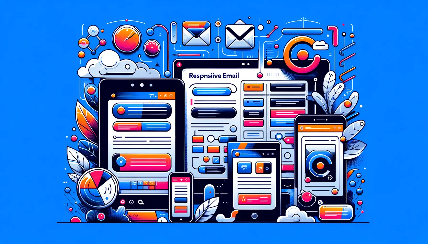
The Role of Responsive Design in Email Templates
Responsive design in email templates ensures that your newsletters look great and function well on any device. By adapting the layout to fit screens of all sizes, responsive design enhances the reader's experience, making your content more accessible and engaging. This approach is key for reaching a wider audience effectively.
Creating Mobile-Friendly HTML Email Templates
To create mobile-friendly HTML email templates, focus on simplicity and readability. Use fluid layouts that adapt to various screen sizes, put to work scalable images, and prioritize content hierarchy. your message is effectively communicated, regardless of the device. Incorporating media queries further enhances the mobile experience by applying specific styles to different devices, making your emails look perfect everywhere.
Customizing Fonts and Layout in Responsive Email Templates
Customizing fonts and layout in responsive email templates is key to maintaining brand consistency and reader engagement. Choose web-safe fonts that are readable on all devices and customize layouts using CSS and HTML to create a visually appealing and coherent look. Remember, a well-designed email resonates better with subscribers, encouraging higher interaction rates.
Previewing and Testing Responsive Email Designs
Previewing and testing responsive email designs before sending them out is important. Use tools like Email on Acid and Campaign Monitor to simulate how your emails look across various email clients and devices. This step ensures that all subscribers receive your message as intended, providing a effortless experience that boosts engagement and minimizes unsubscribes.
Coding Responsive Emails: Best Practices and Strategies
Implementing Media Queries for Responsive HTML Emails
Media queries are a cornerstone of coding responsive HTML emails. They enable you to apply different styles based on the recipient's screen size, ensuring that your email adapts perfectly to any device. When coding, include media queries to adjust layouts, font sizes, and images, ensuring a fully responsive and engaging email experience for every subscriber.
Optimizing CSS for Different Email Clients
Optimizing CSS for different email clients can be challenging due to varying levels of support. To ensure compatibility, use inline CSS, avoid complex styles that may not be universally supported, and test your emails extensively. Tools like Mailchimp and Campaign Monitor offer built-in testing features to improve this process, helping you deliver polished and professional emails.
Creating Customizable Templates for Email Marketing Campaigns
Creating customizable templates for email marketing campaigns allows for flexibility and brand consistency across all communications. Use HTML and CSS to build templates that can be easily modified with different content, colors, and images. Offering a library of customizable templates on platforms like GitHub can significantly enhance the efficiency of email marketing efforts, enabling brands to maintain a cohesive identity while catering to diverse campaign needs.
Ensuring Compatibility with Various Email Clients
Ensuring compatibility with various email clients is vital for the success of your email campaigns. This means rigorously testing your emails across platforms like Outlook, Gmail, and Yahoo to identify and fix issues that could affect layout or readability. Using tools such as Litmus or Email on Acid can simplify this process by providing insights into how your emails render on different clients, allowing you to make necessary adjustments for a smooth subscriber experience.
By adhering to these best practices and strategies, you can create responsive and engaging email designs that captivate subscribers, enhance your brand's image, and drive successful email marketing campaigns.
Responsive Email Design: Enhancing User Engagement and Experience
The Impact of Responsive Email Templates on User Interaction
Responsive email templates significantly increase user interaction by providing a easy viewing experience across all devices. Whether your subscribers are on desktop or mobile, a responsive design ensures your message is delivered effectively, boosting engagement and conversion rates.
Utilizing Media Queries for Fully Responsive Email Designs
By using CSS to apply different styles based on device characteristics, you can ensure your emails look perfect whether they're opened on a smartphone, tablet, or desktop. A quick tutorial on integrating into your email building process can dramatically improve the responsiveness of your marketing emails, making them more effective and user-friendly.
Enhancing Email Marketing Campaigns with Responsive Templates
Responsive templates are a breakthrough for email marketing campaigns. They allow you to develop emails that automatically adjust to fit the viewer's screen, ensuring your message is always clear and engaging. By employing a template library of responsive designs, marketers can quickly create impactful emails for various purposes, from welcome emails to receipt confirmations.
Incorporating features like social media icons and editable sections further enhances the versatility and effectiveness of these templates. Testing your emails across platforms like Gmail and on different devices is significant to verify their responsiveness, ensuring every campaign resonates well with your audience, regardless of how they access their inbox.
Design is not just a trend; it's a necessity where mobile email opens account for a significant portion of all email interactions. By focusing on responsive designs, utilizing , and applying the power of responsive templates, brands can create emails that not only look great on every device but also drive higher engagement and better user experiences.
This approach is especially beneficial for agencies and small businesses looking to maximize the impact of their email marketing efforts without extensive resources. Remember, the goal is to create emails that look and function flawlessly, matter the device, ensuring your message resonates with every subscriber and encourages them to engage with your content.
Dive into the future of meaningful communication with us and watch your audience grow, engage, and thrive.
FAQs
How do I create a ?
To create a , start by using HTML and CSS, focusing on fluid layouts, flexible images, and to ensure your design adapts to various screen sizes. Utilize inline CSS for styling and test your email across multiple devices and email clients to ensure compatibility and responsiveness.
Is email template responsive?
An email template is responsive if it's designed to adapt and look great across all devices, from desktops to smartphones. This is achieved through the use of fluid grids, flexible images, and CSS media queries within the template code, ensuring optimal readability and interaction on any device.
What framework makes responsive email?
Frameworks like MJML, Foundation for Emails, and Email on Acid provide pre-built components and tools to simplify the creation of s. These frameworks handle the heavy lifting of coding responsive designs, allowing you to focus on content and design, ensuring your emails are mobile-friendly and look great on any email client.
Is React email responsive?
React itself is a JavaScript library for building user interfaces and isn't directly used for email development due to the limited support of JavaScript in email clients. However, you can design s by using HTML and CSS principles that ensure responsiveness, and then convert React components to HTML emails with tools that bridge the gap, ensuring they're responsive across devices.
Frequently Asked Questions
What are the best approaches for creating mobile-friendly html email templates?
To create mobile-friendly HTML email templates, focus on simplicity and readability. Use fluid layouts that adapt to various screen sizes, put to work scalable images, and prioritize content hierarchy. your message is effectively communicated, regardless of the device.
What are the best approaches for customizing fonts and layout in responsive email templates?
Customizing fonts and layout in templates is key to maintaining brand consistency and reader engagement. Choose web-safe fonts that are readable on all devices and customize layouts using CSS and HTML to create a visually appealing and coherent look. Remember, a well-designed email resonates better with subscribers, encouraging higher interaction rates.
What are the best approaches for previewing and testing responsive email designs?
Previewing and testing responsive email designs before sending them out is important. Use tools like Email on Acid and Campaign Monitor to simulate how your emails look across various email clients and devices. This step ensures that all subscribers receive your message as intended, providing a effortless experience that boosts engagement and minimizes unsubscribes.
What are the best approaches for implementing media queries for responsive html emails?
Are a cornerstone of coding responsive HTML emails. They enable you to apply different styles based on the recipient's screen size, ensuring that your email adapts perfectly to any device. When coding, include to adjust layouts, font sizes, and images, ensuring a fully responsive and engaging email experience for every subscriber.
What are the best approaches for optimizing css for different email clients?
Optimizing CSS for different email clients can be challenging due to varying levels of support. To ensure compatibility, use inline CSS, avoid complex styles that may not be universally supported, and test your emails extensively. Tools like Mailchimp and Campaign Monitor offer built-in testing features to improve this process, helping you deliver polished and professional emails.
What are the best approaches for creating customizable templates for email marketing campaigns?
Creating customizable templates for email marketing campaigns allows for flexibility and brand consistency across all communications. Use HTML and CSS to build templates that can be easily modified with different content, colors, and images.
Inagiffy — Premium newsletter growth for brands that take email seriously. Strategy, design, and delivery handled for you. See what we do.
Related Articles
